Brand identity
Selected branding projects showcasing concept development, visual identity and brand application.
Cuckoo Fields | Residential Development
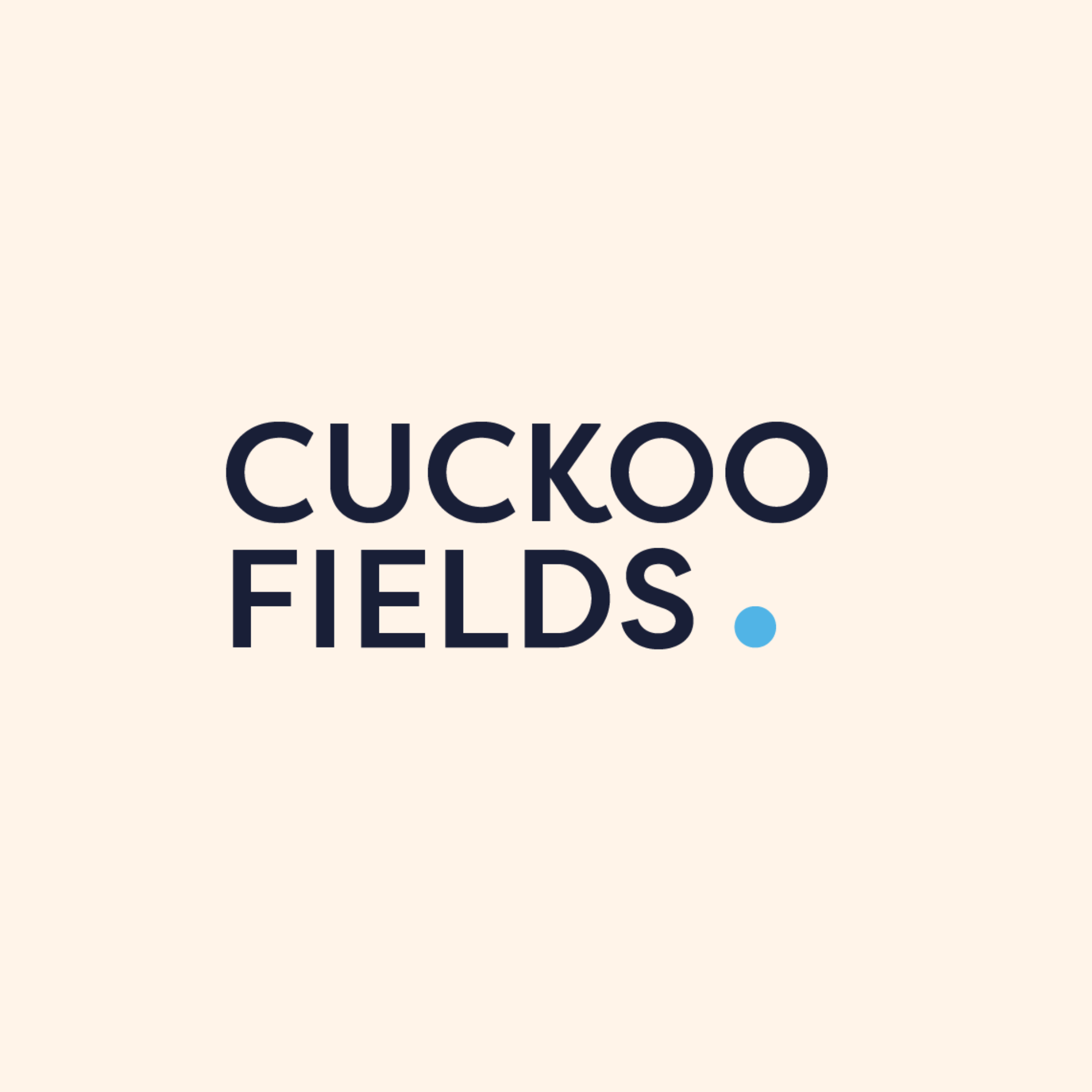
A fresh visual identity for a new residential development, designed to feel approachable, contemporary and distinctive.
The Brief
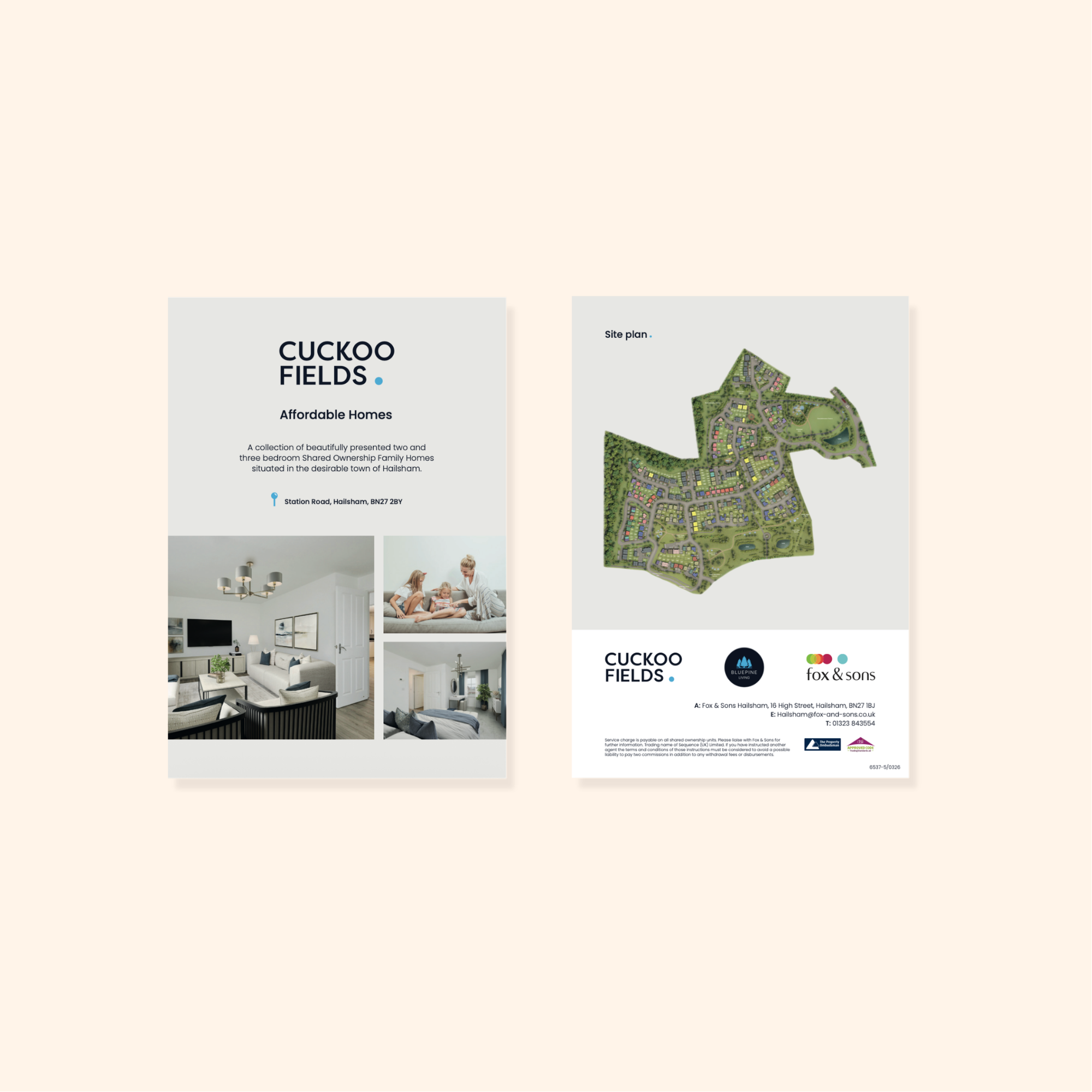
Cuckoo Fields was a new residential development briefed by the Land & New Homes team. The aim was to create a friendly, modern brand that would resonate with a younger audience while giving the development a recognisable identity.
The Creative Direction
The initial concepts explored monogram-led marks, considered colour palettes and subtle architectural references. The final direction centred on a bold, typography-led wordmark, with a bright blue accent adding energy and personality. The result is a clean, confident identity that balances simplicity with approachability.
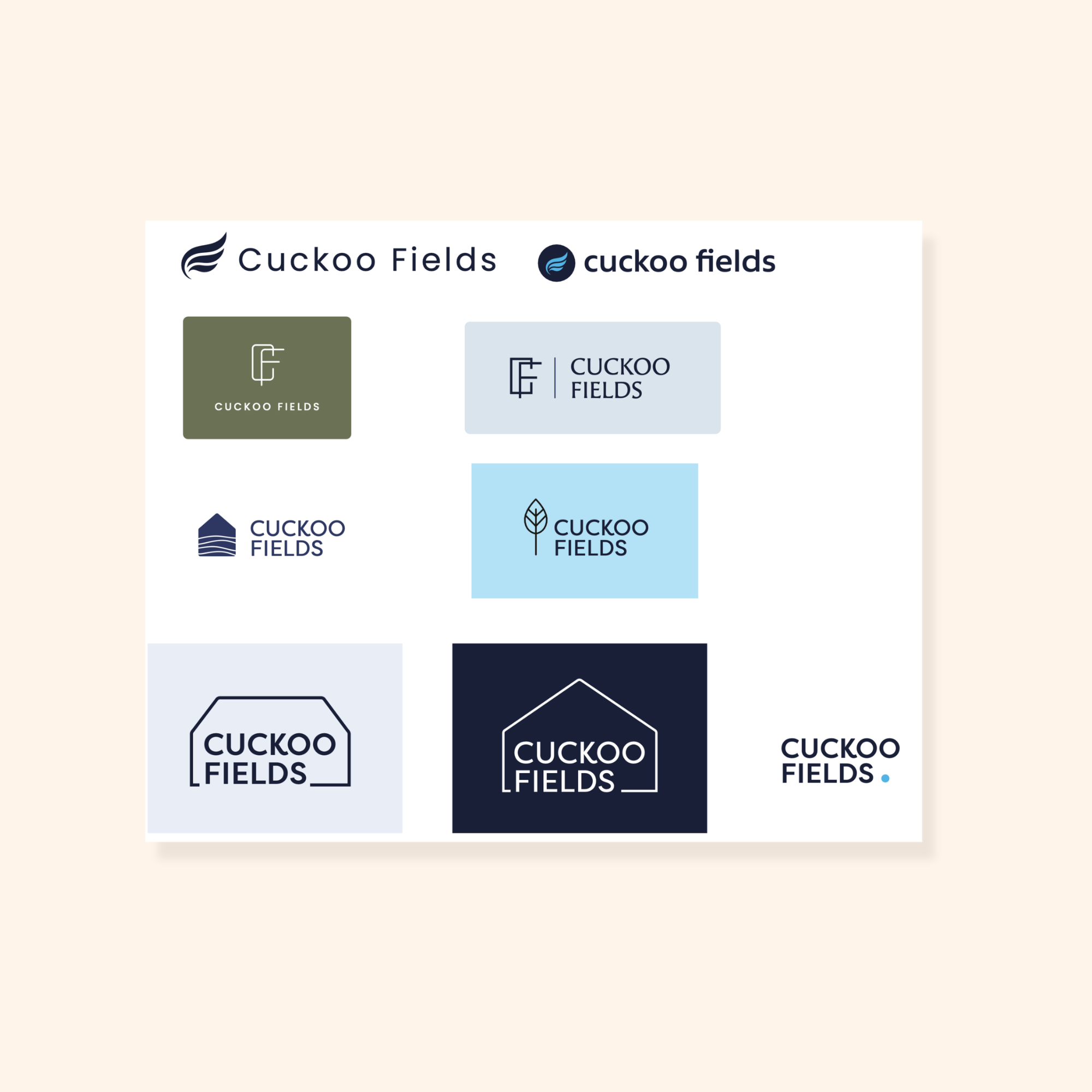
Brand Exploration
Alternative logo concepts explored different ways to express the Cuckoo Fields identity, from architectural motifs to simplified symbols and typographic treatments. This process helped establish a visual direction that felt distinctive, versatile and appropriate for the development.
Wembley Way | Residential Development
A dynamic, urban visual identity for a landmark regeneration development, designed to make homeownership feel attainable, modern, and accessible.
The Brief
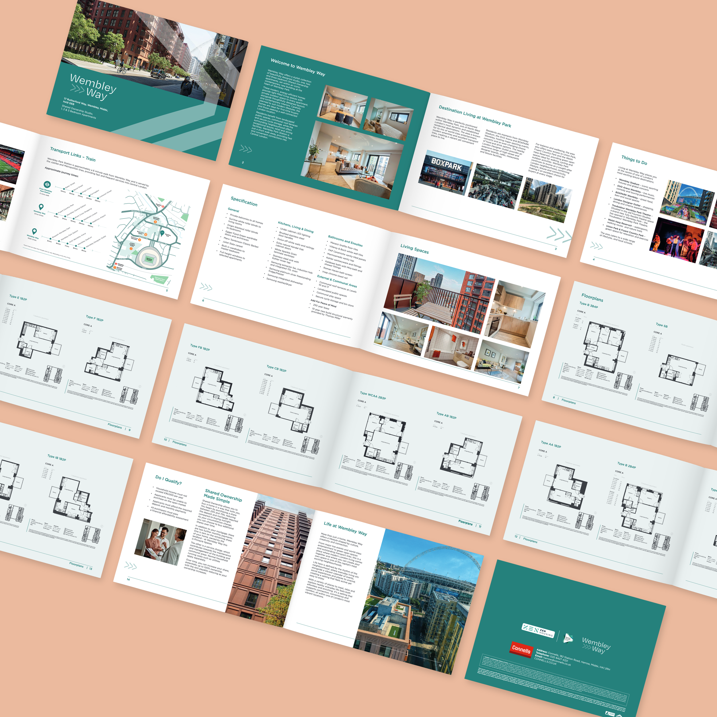
Situated at the heart of the Olympic Way regeneration in North-West London, Wembley Way required a distinct identity that stood out within a fast-evolving urban district. The brief was to create an approachable, high-energy brand tailored to younger first-time buyers, positioning Shared Ownership as an inspiring, realistic step onto the property ladder.
The Creative Direction
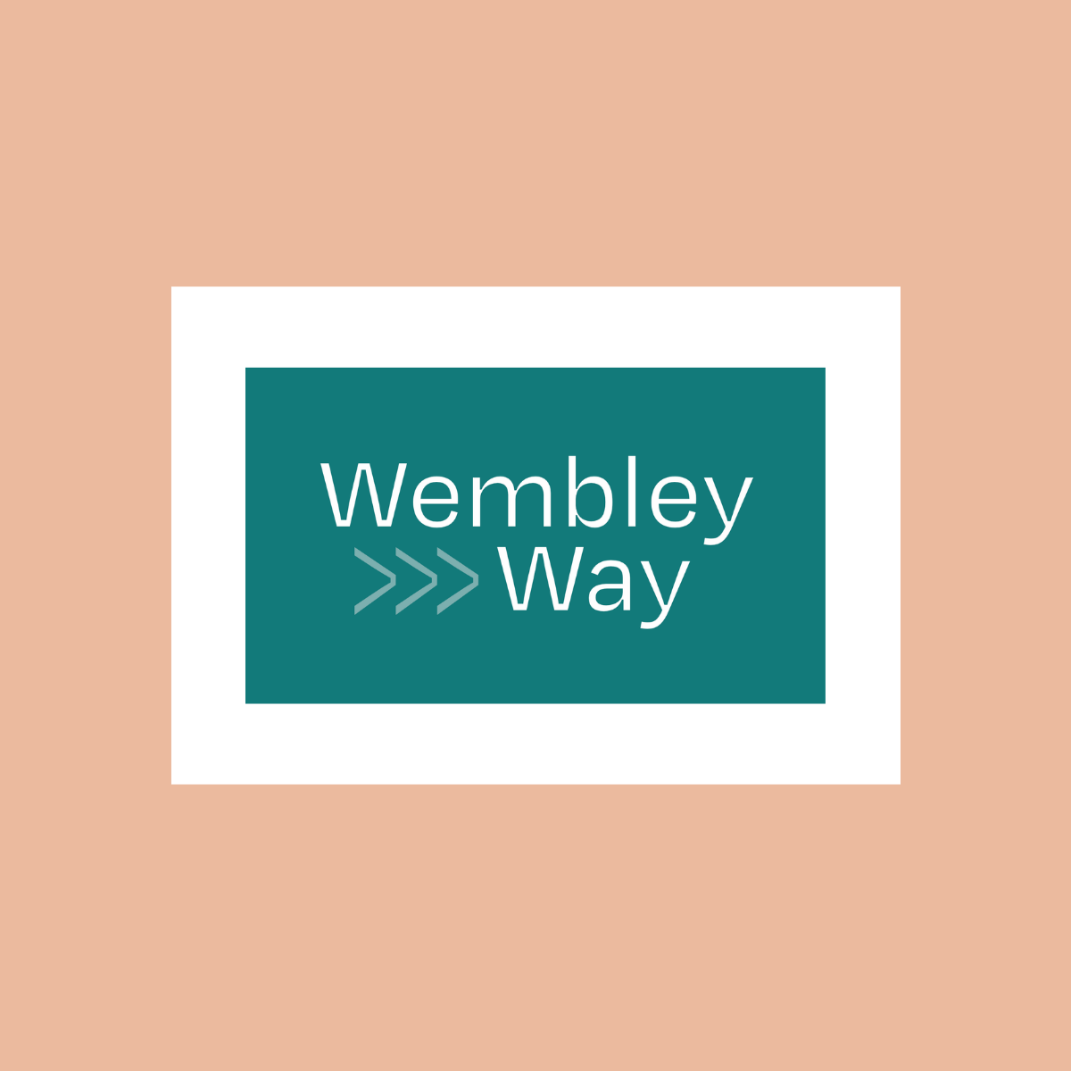
The identity centres on momentum, progress, and finding your way onto the housing ladder. Drawing inspiration from the iconic walkway itself, the logo integrates a forward-moving chevron motif (>>>) paired with a clean, contemporary sans-serif typeface. A confident deep teal and mint palette brings an urban, youthful feel while maintaining the credibility expected of a major London residential scheme.
Brand exploration
Early concepts explored a variety of visual devices - from architectural monograms to transit-style wayfinding marks. I also tested different typographic weights and colour pairings, ensuring the final route would translate across sales brochures, marketing suites, site hoardings, and digital campaigns.
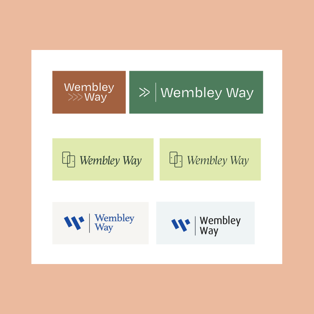
Initial logo and colour concepts
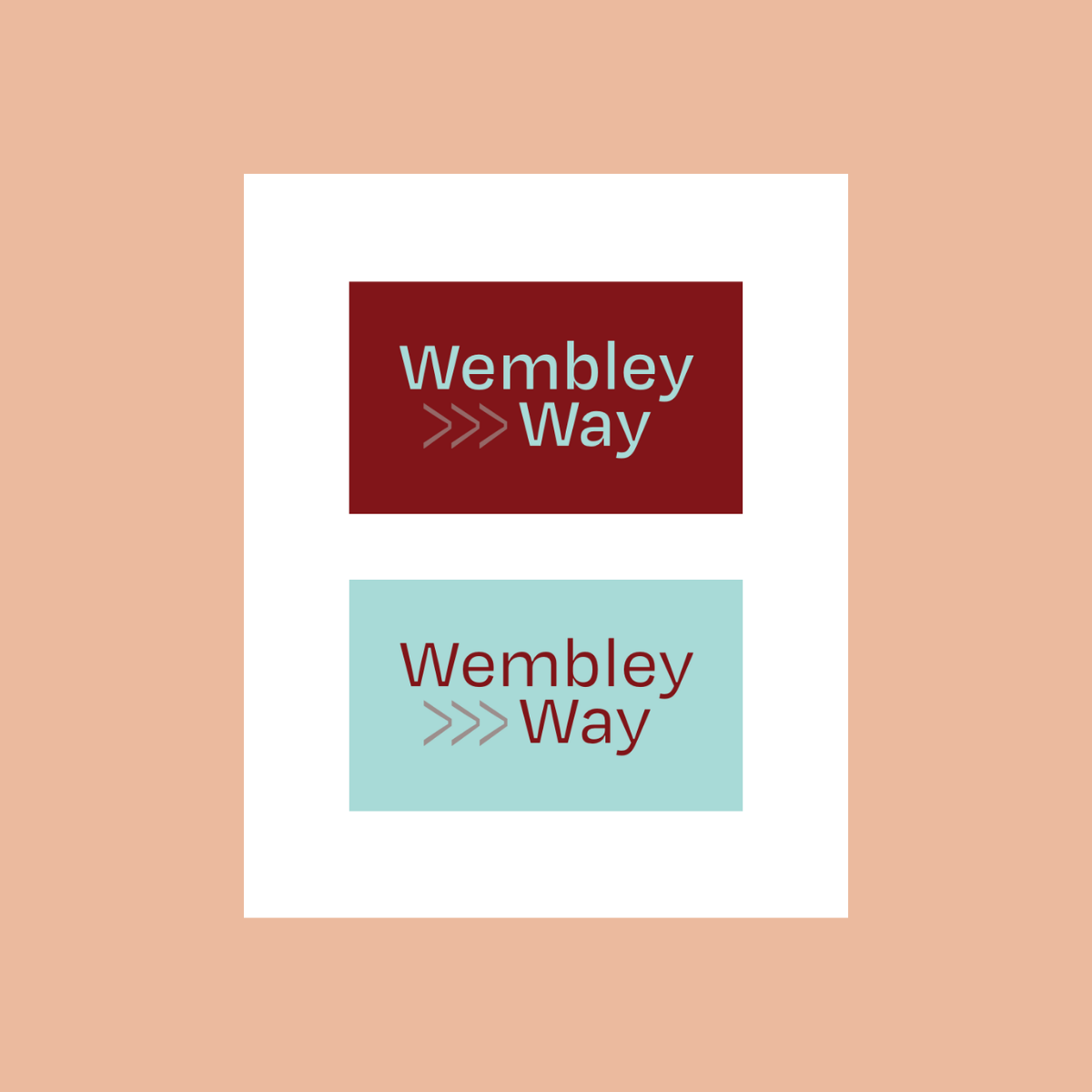
The chosen logo testing new colour options